Notts LGBT+ Network guide to the evolution of the Pride flag from 1974 to today.
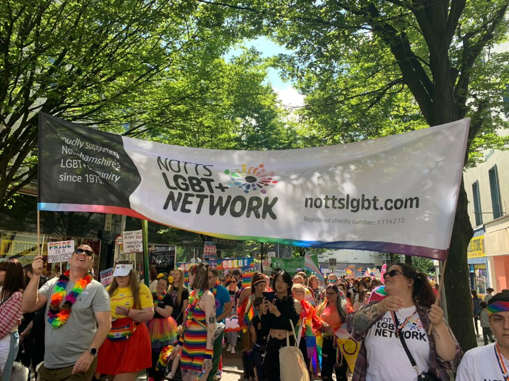
Anyone who visited Notts Pride this year, wont have failed to notice thousands of Pride flags across the city. From shop windows and street bunting, to clothing, face paint or flags waved along to the music, Nottingham was bursting with every colour of the rainbow.
It is always amazing to see the Pride movement in our city getting bigger and louder every year and it seems that more people and businesses than ever took part this year. The eagle-eyed amongst you, may also have noticed the different variations of the Pride flag on display.
With that in mind, we thought it would be useful to provide a Notts LGBT+ Network guide to the evolution of the Pride flag from 1974 to today.
1974 – 1978

Up until 1974, the Pink Triangle was the symbol used by and for the gay community. It was co-opted from the Nazi symbol that had previously been used to persecute the community.
However, back in the 1970s, American artist and designer Gilbert Baker was challenged by activist and politician Harvey Milk to create a new design for the gay community. The initial rainbow was developed to signify a new dawn and Baker’s original design featured eight colours, each representing different aspects of diversity in the community.

By the time the flag received its debut in 1978, the design was adapted, however the hot pink colour was removed due to a lack of availability in fabric.
1979
In 1979, demand for the Pride flag increased following the assassination of Harvey Milk in November 1978 and production was ramped up. The turquoise stripe was dropped and the indigo stripe was also changed to purple to ensure that colours readily available as dyes and fabrics were used so people around the world could make their own version.
This version is still recognised today as the ‘standard’ Pride flag.

2017
The Pride flag remained largely untouched for nearly 40 years. In 2017, Philadelphia City Hall in the USA unveiled a Pride flag that included black and brown stripes to represent ethnic minority members of the community and the discrimination they often face.

2018
The following year saw a significant change when non-binary designer Daniel Quasar developed the Progress Pride Flag.
The inclusion of the five coloured chevrons to the left of the design used throughout the 80s, 90s and 00s, represent the inclusion of ethnic minorities and the trans community. The chevrons point to the right, showing the ongoing progress and evolution of the LGBTQ+ community.

2021
The latest addition to the Pride flag took place in 2021, when Valentino Vecchetti adapted Quasar’s flag. The intersex flag was incorporated into the design, creating the most progressive version of the Pride flag.

Whichever version of the Pride flag is used, it remains an incredibly important symbol for our community and will always represent protest, inclusion, a safe space, pride, celebration, allyship and understanding.


